Showing posts with label typography. Show all posts
Tuesday, 19 July 2011
On Your Marks
Graduation is approaching and the Degree show seems like so long ago!
On Your Marks had a brilliant opening night with plenty of interest! The place was packed within the first hour and the reaction to the show was great! It was a proud night for all of us D&ADers, seeing peoples reactions too our work was quite surreal, looking at their facial expressions towards the work and hearing peoples comments were on a whole encouraging! Our show was a great success which I will not forget!
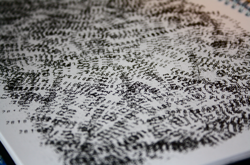
I had two A2 prints which were printed elsewhere and mounted onto foam board and three books in the publication room on a nice stand accompanied by gloves, it was nice to see my work properly on display rather than pinned to a wall above my workspace!!
The night gave us a chance to celebrate our challenging three years! We had nothing to do but mingle, drink and look at what we had all achieved. Catching up with tutors and seeing faces from the year above and also industry was a good feeling. I can't wait to see what next years degree show beholds, I wonder if it will be as much of a success as ours was!
To read a review and see more work from the show please visit the Creative Times website to get their opinion on the show! http://www.creativetimes.co.uk/articles/review-on-your-marks-2011-degree-show
Labels:
featured,
inspiration,
photography,
Posters,
typography
Wim Crouwel a Graphic Odyssey
During a trip to London with Becky Doherty we visited the Design Museum to see the Wim Crouwel exhibition. After walking around the Tate Modern and feeling very uninspired we were so happy to find this excellent collection of work! We were amazed by this museum!
Wim Crouwel a Graphic Odyssey was packed full of inspiring typography, logos and print designs - something we were craving for after the Tate and V&A visit! Although the Design museum is only very small each piece was individually inspiring - Quality over Quantity!
By far the best exhibition I have been to recently!
http://designmuseum.org/exhibitions/2011/wim-crouwel
Labels:
inspiration,
London,
museum,
rodo,
typography,
Wim Crouwel
Friday, 15 July 2011
Type Matters!
I turned up for my regular feed back session with John and ended up being taken to a lecture with the MA students about Typography! Loved the spontaneity!
Jim Williams, a Graphic Design Lecturer at Staffordshire University who has achieved recognition in a number of national and international award schemes, was taking the talk. This was the first lecture I’d had on type, considering I was looking at typefaces at the time for my final project, it was essential that I learnt the basics! This lecture seemed to come at the most appropriate time for me!
His book ‘Type Matters’ gives simple tips on how to keep your type in order. Although the rules of typography are so obvious to me now, before Jim pointed them out, I wouldn’t have noticed these minor yet so important mistakes! So inspired by these rules I requested a £5 copy from Staffordshire University, currently waiting for it to arrive in the post but I think this book is a must have for every Designer! This clarity of typography must carry on, and to do so, knowledge needs to be passed on to up and coming designers. I think Jim is doing a brilliant job!
After the lecture I felt refreshed, typography has always been a fear of mine, this term has helped me to build confidence and the lecture was like the icing on the cake! Looking back over some second year work I have noticed some of these mistakes that I have now corrected, I have been passing on some tips to fellow students who weren’t lucky enough to attend the lecture. Simple tips, but essential ones!
Thursday, 14 July 2011
Owt Creative
![]() |
Today I received Owt issue 7 through the post! A great zine which runs along the theme of Science. I submitted some work and was lucky enough to be chosen! This is the first time I have featured in anything and I love the feeling (Hence me buying three out of excitement!!). If you haven't seen any of Owt's work before I suggest you take a look at the website, keep an eye on what themes are up and coming and submit like I did! http://www.owtcreative.com/
The typeface I submitted was my Chaos Typeface which I designed in my final year of Uni. I created this in response to the chaos theory.
The letters were taken through a number of minute changes which would over time create a significant difference. The Chaos theory suggests that the minor mistakes in our world can multiply over time and create life changing outcomes. Below are the transformations I took these letters through. A very small difference, but you can see how it develops and transforms after repeating the process a number of times.
Rotated anti clockwise by 1mm
Increased in size by 1mm
Moved up 1mm
Its nice to see fellow D&ADers in Owt also! Chris Heap on the first page and Lauren Atkinson!
Friday, 29 April 2011
Helvetica Landscape- 3D


Building a Typographic land... Laser cut Helvetica letters from ply wood and clear perspex. Each letter gradually gets smaller as the landscape builds up. My original thoughts came from the Chaos Typeface I made - One minor difference which adds up to create a significant one. These letters shrink by just one millimeter- a tiny change but as it progresses the shape changes dramatically.
Around the outside are the off cuts from the laser cutting process, I thought these were great and didn't want to throw them away! Placing them around the edge forms a 'floor' to surround the landscape... Thinking about promoting this as a life sized typographic land for people to visit! I was also thinking about what the land could be called... the letters could spell it out? From the side it would look like an odd town - from above you would be able to see the letters and the title of the place.
Sunday, 24 April 2011
Blush Publishing
Saturday, 23 April 2011
Small Print. Big Impression


Exhibition in the Leicester New Walk Gallery, focusing on printing processes- appropriate to my print project! Love the layer effects in these images. The overlap of different print techniques has come off really successfully- Nice to see that people still have a passion for these methods of printing!
Subscribe to:
Comments (Atom)


